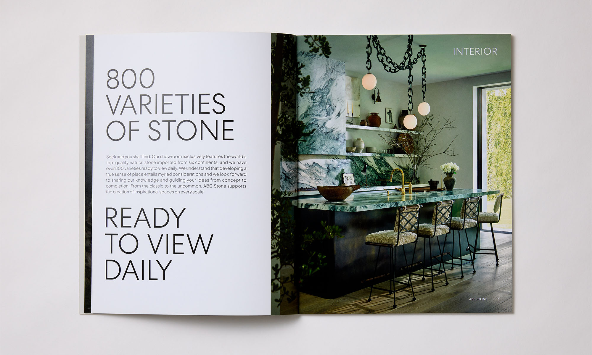
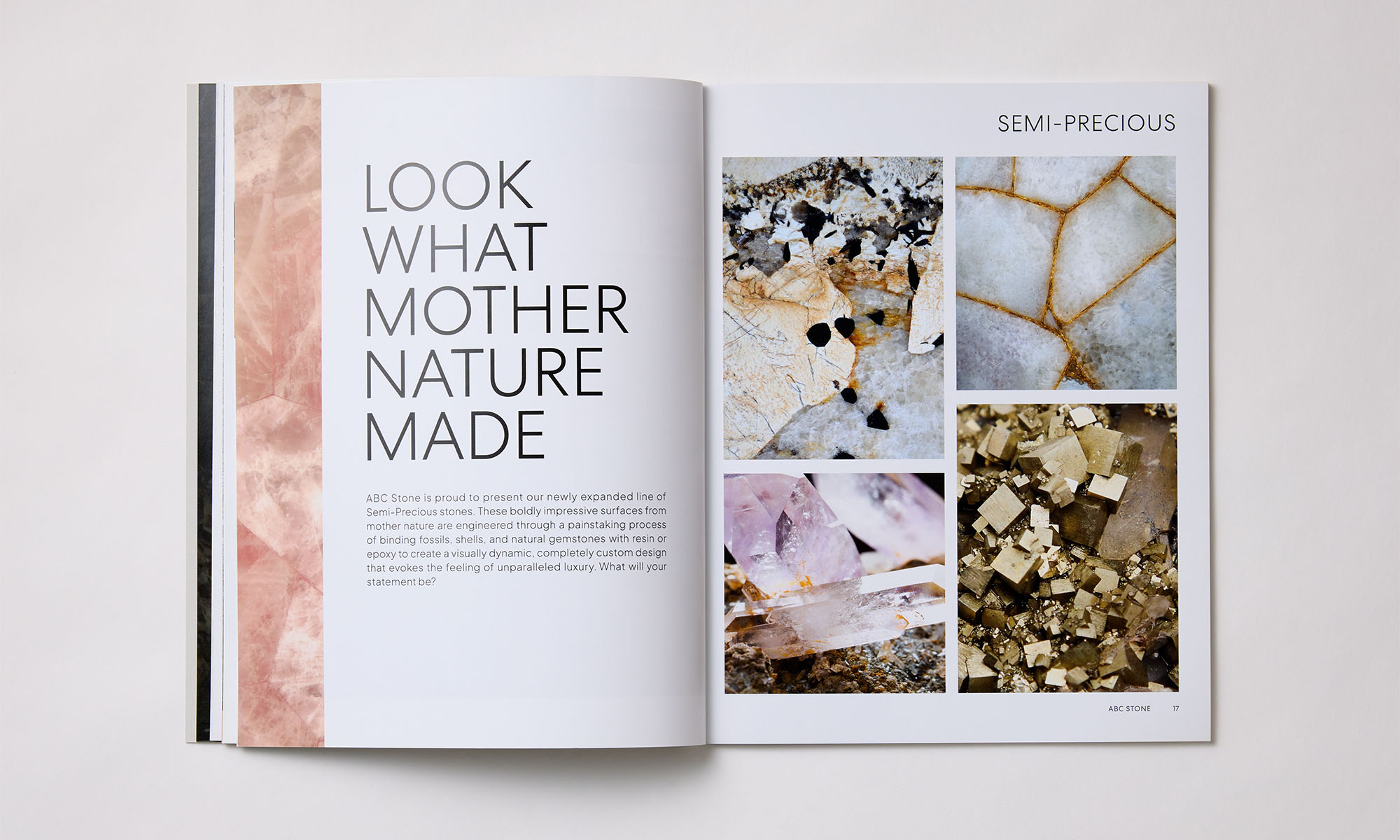
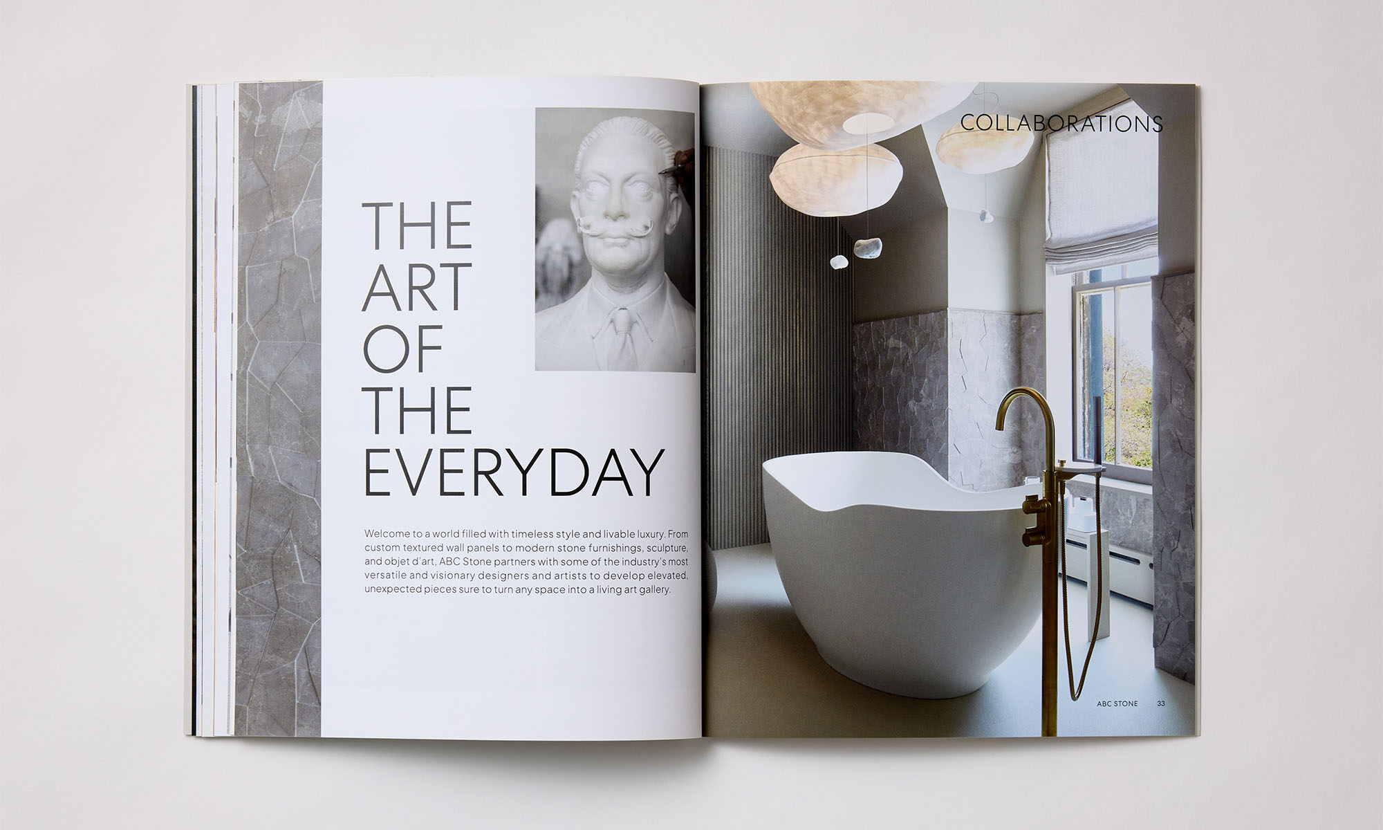
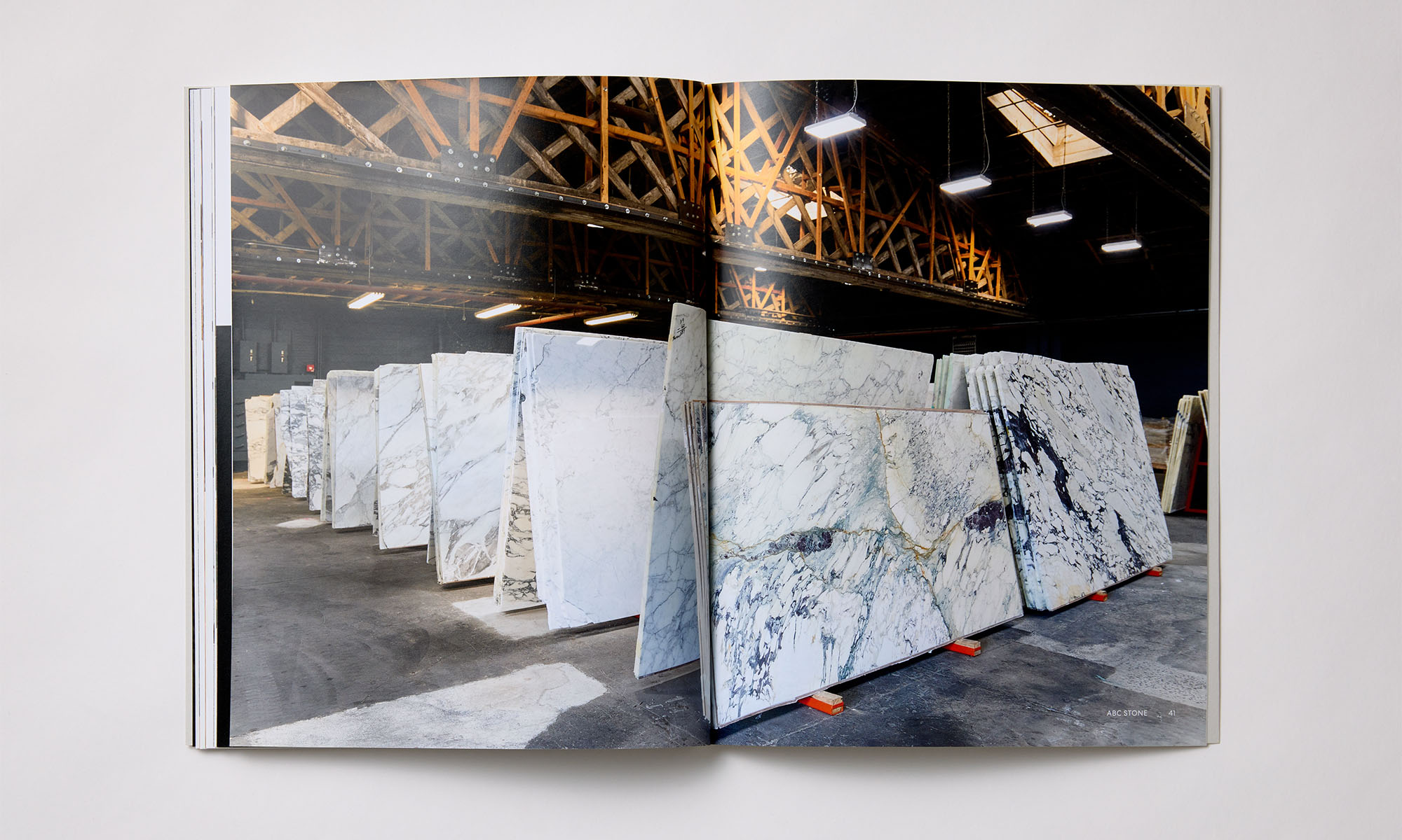
ABC Stone
Our work for MR Architecture + Decor caught ABC Stone’s attention, resulting in a brand identity overhaul and an ongoing creative collaboration.
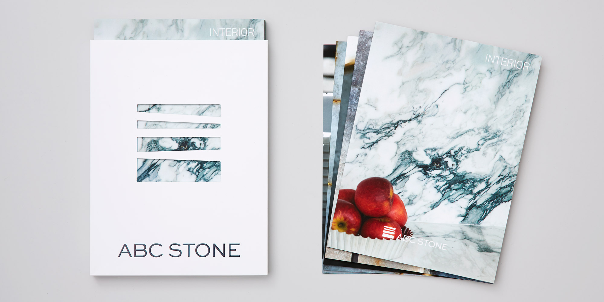
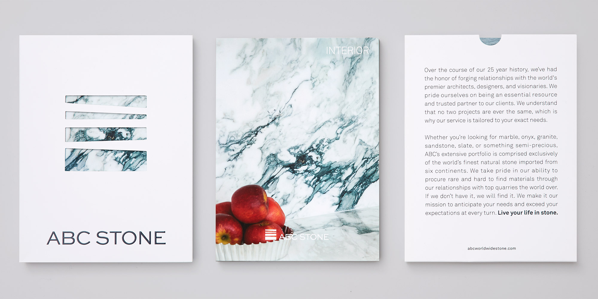
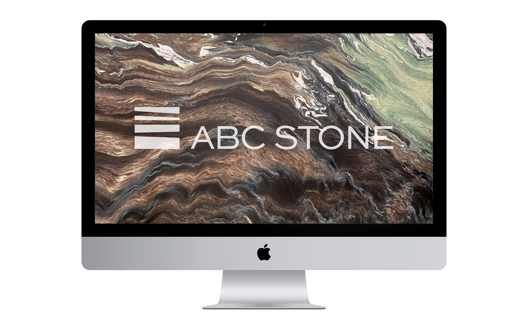
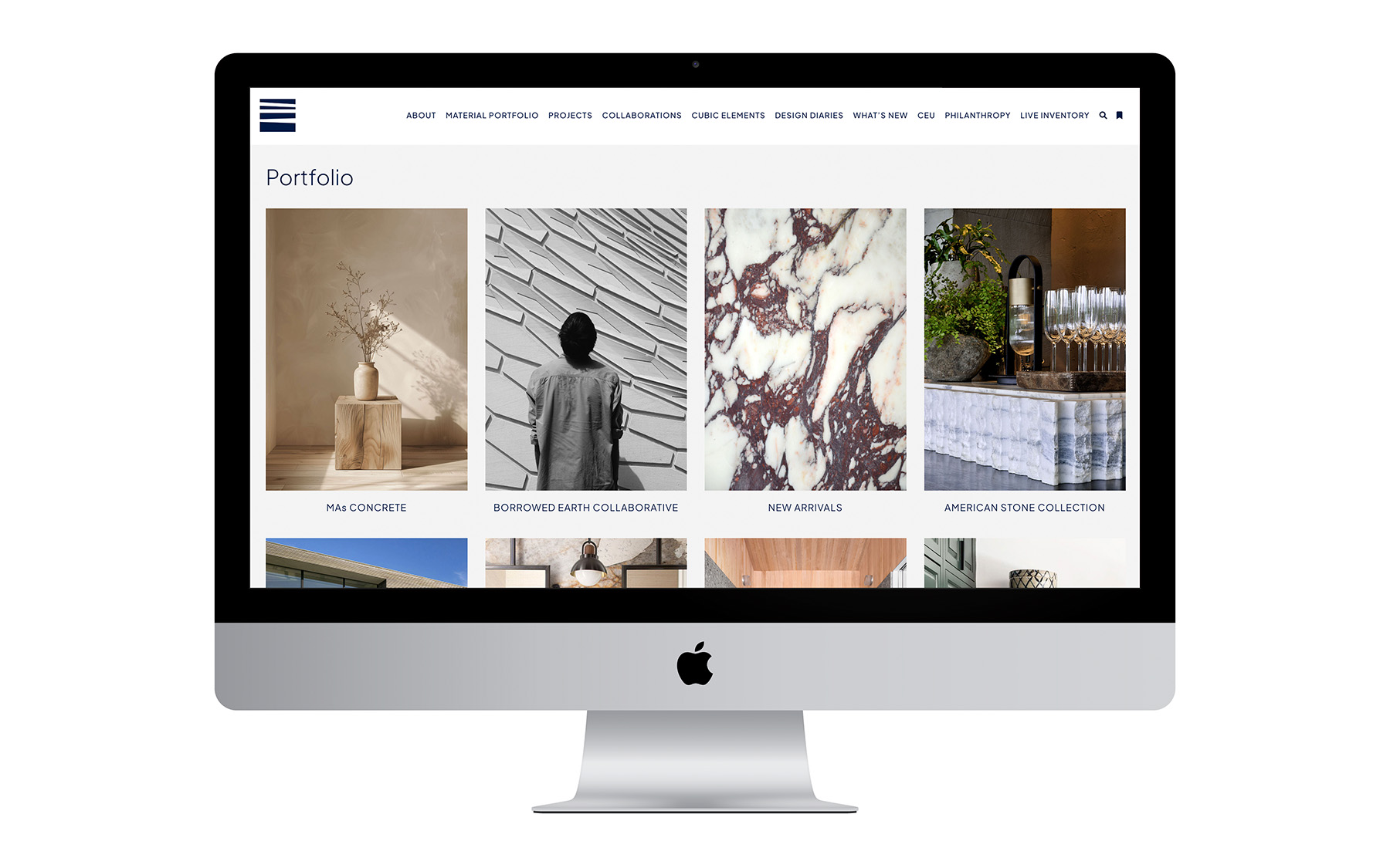
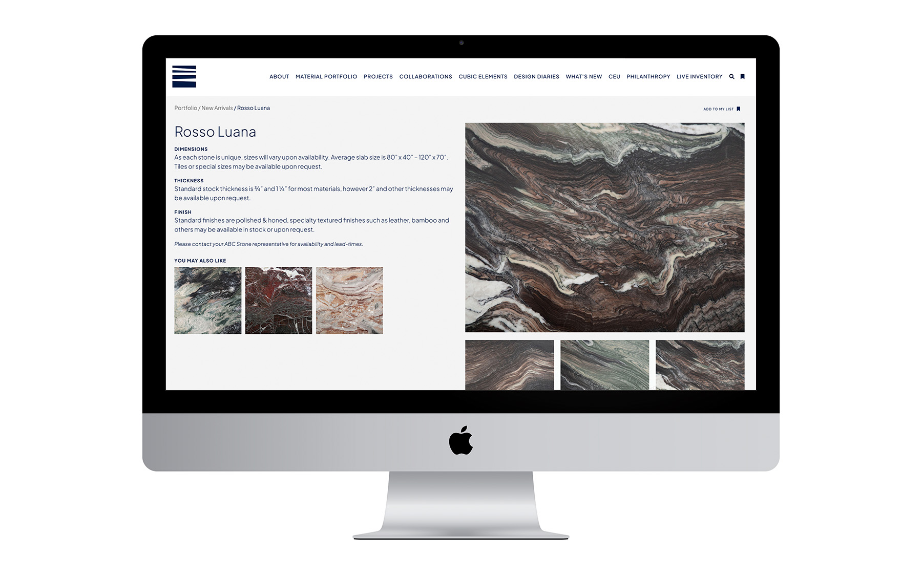
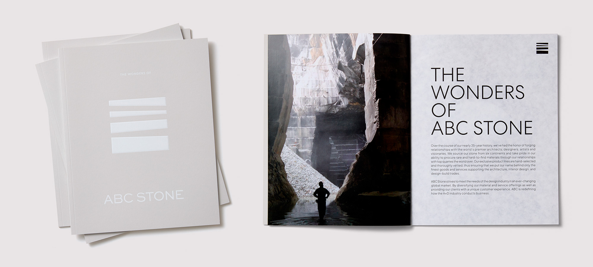
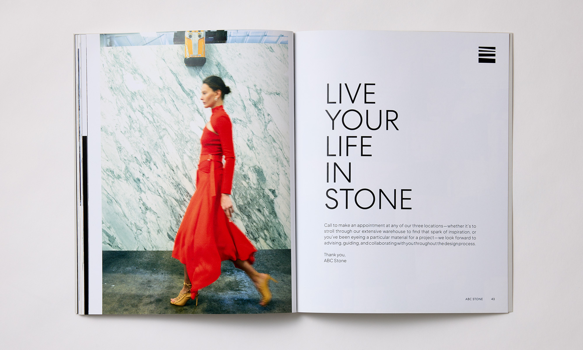
The pictographic logomark immediately says stone and lends itself to various tactile applications, like an embossed foil stamp or a die-cut on the front of their marketing material shown below. The website, with its extensive material portfolio subdivided in multiple categories does not feel like a maze, thanks to minimal navigation with large, descriptive images that invite exploration.
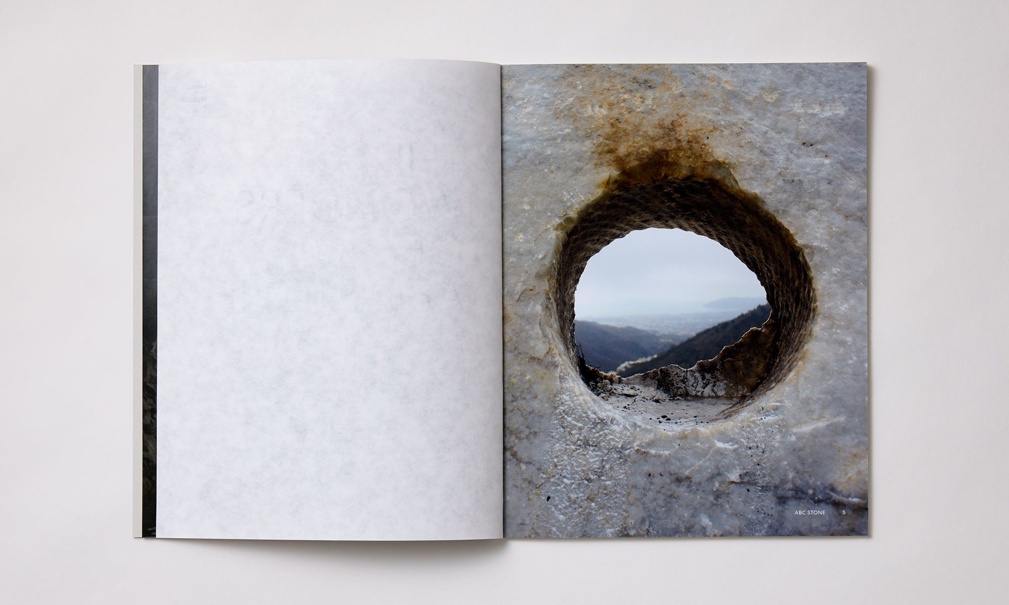
Promotional Booklet:
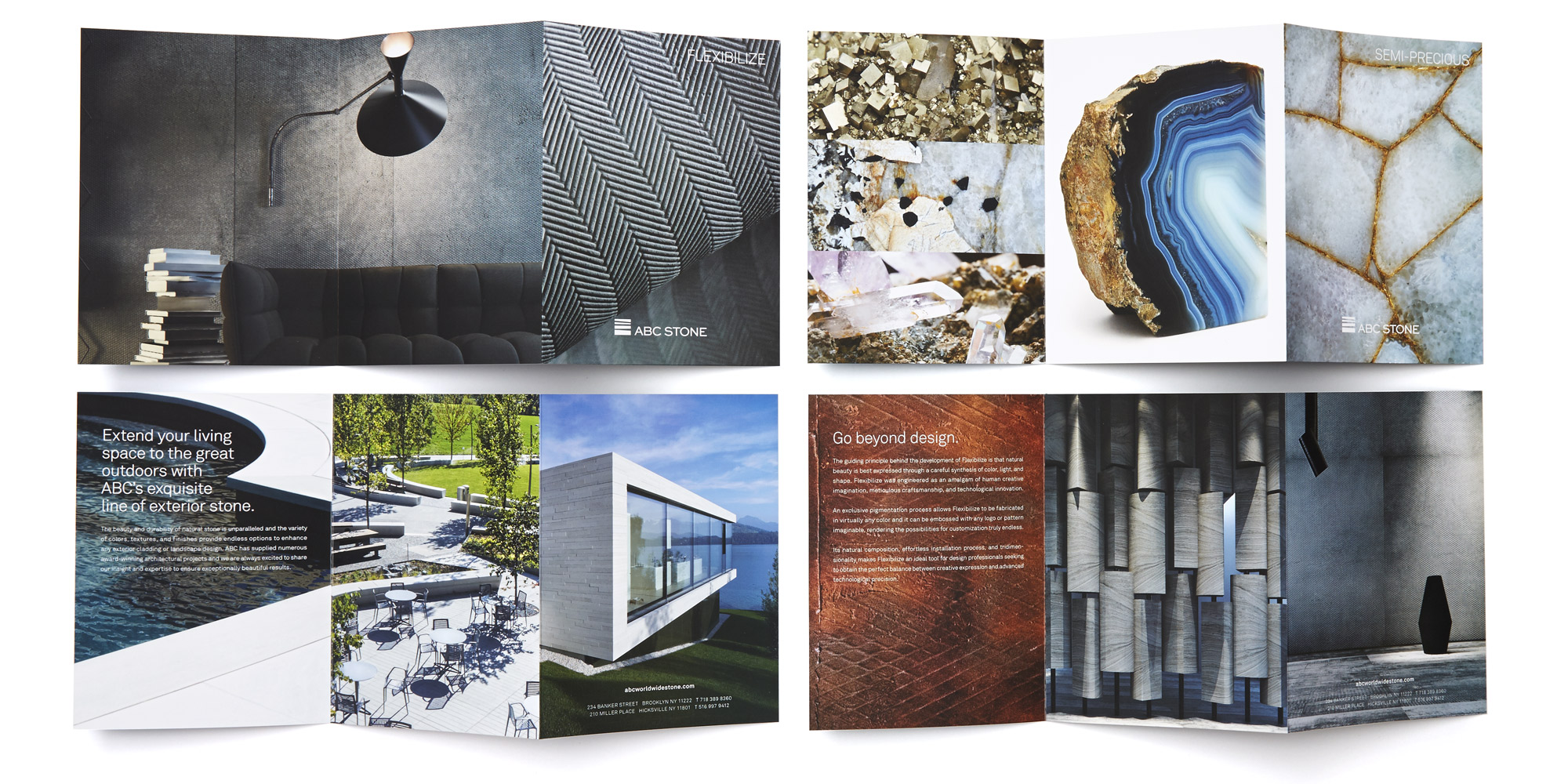
Promotional Sleeve + Brochures: